playing with digital
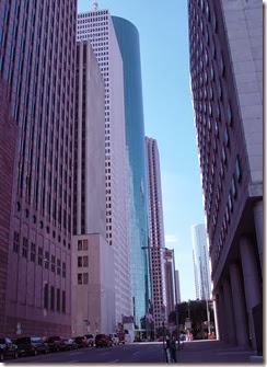
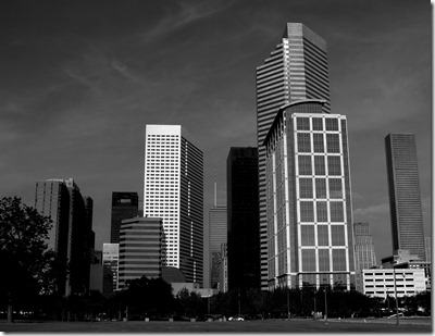
For FSO I have done Black & White three times, this is the 4th time. This is the second Houston as my hometown. How I wished I could have used the mountains of Nova Friburgo for my experiment, just so I could have the depth of our view to play with after reading Mersad’s tutorial. I guess I played around for a couple of hours, coming to the conclusion that my editor ADCSee 14 and ADCsee Pro 5 are not very good / I am not very good / I choose the wrong photos to play with. But I did learn that there is more to do than just ask the program to convert to B&W.
I used this format in one of my other posts on black and white and liked very much seeing the comparisons and reading everyone’s comments – so my FSO experiments in black and white editing.


I like No 1 (the portrait), 3 and 5 (I think they have more interesting b/w contrasts than no 2 and 4). The last photo is also taken from an interesting angle.
ReplyDeleteMonica, the original photos are better so the conversion to B&W end up better. usually when I have an interesting angle it is because I am trying to eliminate something funky from the photo like a garbage can....thanks for your comment, you picked my favorites.
DeleteLove those patterned carpets. It sure gives a different perspective to see black and white next to the same photo in color.
ReplyDeleteRuth, I didn't show the original of the carpet because the colors are just wonderful, defeated the purpose....
DeleteI agree with Monica with my "best picks" for today. I love the strength that black and white gives to the portrait subject and think the buildings in the 3rd shot look more interesting without the softening effect of the blue sky. The light looks stronger, too. Your composition is always good and helps make the images more powerful. Good work, Ginger!
ReplyDeleteMy favorite is the last one!
ReplyDeleteGreat dramatic black and white conversions!
ReplyDeleteMersad
Mersad Donko Photography
Your examples showed the increase in depth you get from color to b/w. Great job.
ReplyDelete