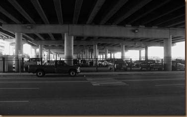
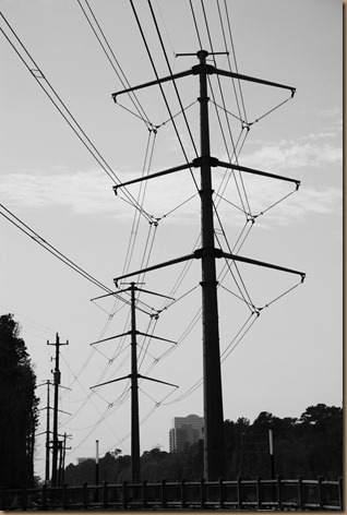
You all know by now that full, bright color is my thing. I think I see more through color than shape or size or lines – when I said this to my mother this week she ask ‘why’. I don’t have an answer and maybe this has no basis in fact – bottom line though is I like color. So to do digital photos in color then turn them to black and white and decide if any are good enough to put in this post was a difficult task for me.
Add to that that I am back in Houston with no archives of the Rio-Niterói Bridge or the train trestle in Nova Friburgo and that in Houston I didn’t find one, not one neat looking bridge. There has to be some, this is the bayou city after all; laced thickly with waterways running a little downhill to the gulf. What is here and available for photos was freeways, high arched overpasses of one freeway over another. Over on the east side of town the exit of the beltway 8 off I-10 headed south the exit (not ramp but bridge) is a terrifying arched, two lane MONSTROSITY – sorry no photo just a memory of finding myself soaring high above the birds as I headed home last summer. I considered briefly making the 50 mile drive (100 two ways) just for you then decided that a $40 fill up with no guarantee that I could stop and get a photo, was too much sacrifice to make for the FSO.
I did manage though to take photos of the 59 as it passes beside the George R Brown in downtown Houston. See how the color adds so much more to the photo? Of course I just got lucky with the red truck coming through at the right time, blending with the red supports. Maybe the problem is when you take in color then digitally convert to B&W – if photos are taken with B&W 35mm film are they better? And manual settings – would that improve the clarity of shadow to sun? I don’t have these answers.
I also have a few photos from Sarasota that I took while visiting this week, but i decided to show them when I show you that city – don’t be kidded this separation of subject was to limit my confusion.


Ginger, that 5th photo is awesome! It's like the beginning of a story. :)
ReplyDeleteOh oh oh how cool was that..I loved how you divided them up! Wow!
ReplyDeleteBeautiful shots every single one!! I loved this theme!! Hugs, Sarah
Ginger - your coments made me think of my dear friend Tom Alleman who has been making black and white photos with tremendous impact.
ReplyDeleteCheck out his Sunshine & Noir series here - http://www.sunshineandnoir.com/
And don't miss his full body of work here: http://www.allemanphoto.com/
I have been his friend for more than 30 years. I am so proud of his development as a man and as a professional photographer.
I hope his 'eye' has something to offer.
I also really love color. It is interesting, though, to compare your shots. The b&w shots have an impact that color can't always achieve. They make you concentrate on the composition and the play of light, and they have a timeless quality that I love.
ReplyDeleteI like B & W photos and most do make an impact, however, the photo with the train really does speak more in color. Love all your shots.
ReplyDeleteI too love color, the richer and brighter the better! But some photos work better in b&w, just because they make us pay more attention to patterns and tones and contrast. A different point of view. I love b&w photography.
ReplyDeleteHave a good weekend!
Well, Ginger, I felt a little frustration in the beginning for you until I looked at your presentation here. These are great!! I really enjoyed how you side/by/side placed the color vs. black and white. Some really do take the eye better in black and white, as others in color. I have not the answer for you about the 35 mm. but think you did a fine job here with what you've shared :)
ReplyDeleteOh...by the way, while I'm here, before I forget again...I've changed my location to a new blog address. Do come visit me, won't you and please edit me on the link list at FSO to the new site? Thank you, Ginger. ~Heather
I like how you show the before and after shots. I have no answers for you. I am still learning as I go with my camera also. nice shoot out!!
ReplyDeleteI really like how you set out this shoot out, Ginger. The comparisons are interesting, huh? I was surprised how some photos look better in black and white.
ReplyDeleteI hope to be like you when I grow up! You are so clever...so clever with this post!
ReplyDeleteI'm like you, preferring colours in my photos.This is almost be like Singapore, with too many overhead bridges for the motorist!
ReplyDeleteGinger, I love these! And I know exactly the Beltway 8 exit....eek. As well as the Rio-Niteroi bridge...that one would be something!
ReplyDeleteAnyway, to make your B&W photos "pop" a little more, in your editing software you should have something that heightens the contrast; you want to hit that and it will make the sun & shadow really stand out. In Photoshop it is just the "auto contrast" and "auto levels" button, but I'm sure if you look around in whatever you use, you'll find it.
Also, play around with whether it matters to do it before or after you convert to B&W.
Good photos, though!